
Unlock the power of people with a strong EVP
By investing in a strong EVP you can attract top talent, and retain loyal employees that are aligned with your purpose and goals.
By investing in a strong EVP you can attract top talent, and retain loyal employees that are aligned with your purpose and goals.
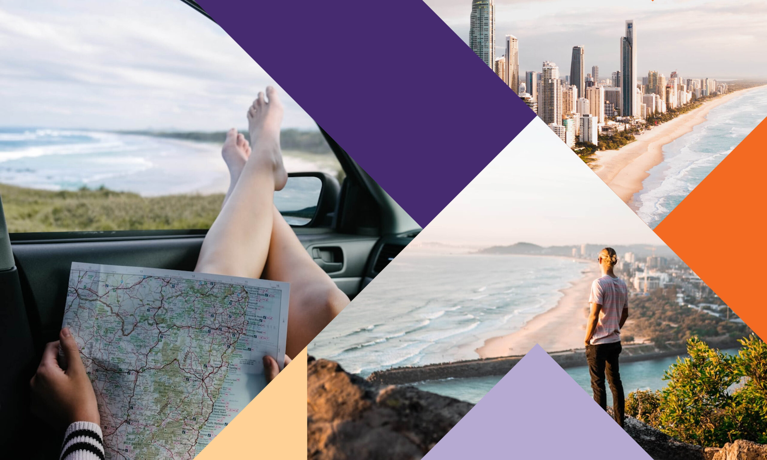
We explore the connection between tourism and economic development, and how to leverage their full potential.
We reflect on 2024 and spotlight five trends to watch in 2025 – shaping how brands connect, tell stories, and drive impact.

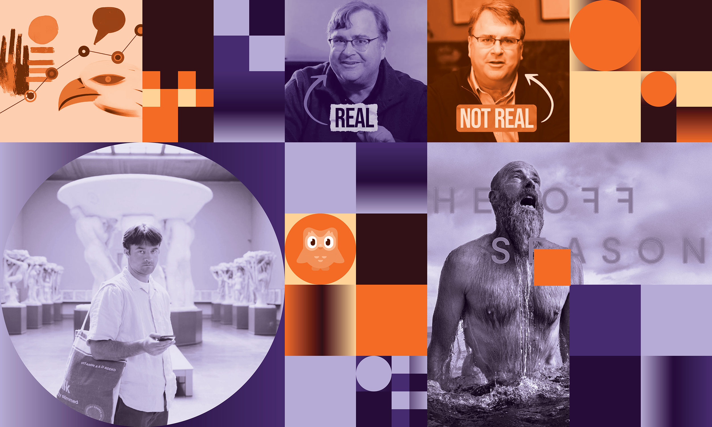
AI has come a long way since our experiments back in 2022. Discover how we used AI to create our Christmas visuals this year.
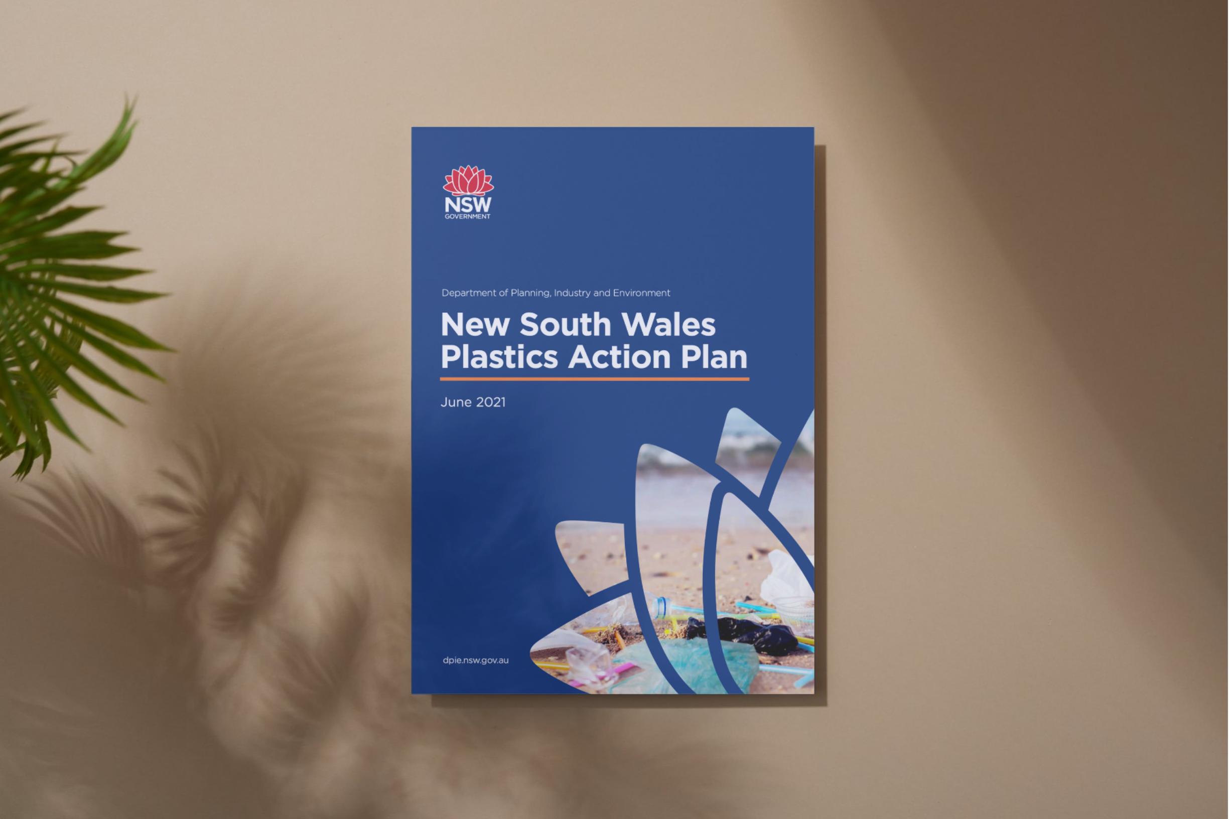
We take a look at how public education campaigns can empower councils to achieve NSW’s Waste Strategy goals.

This blog explores our approach to transforming insights into creative action that connects and resonates.

We explore what VR is, how it was utilised in our project for the NSW RFS, and the future potential of VR technology.
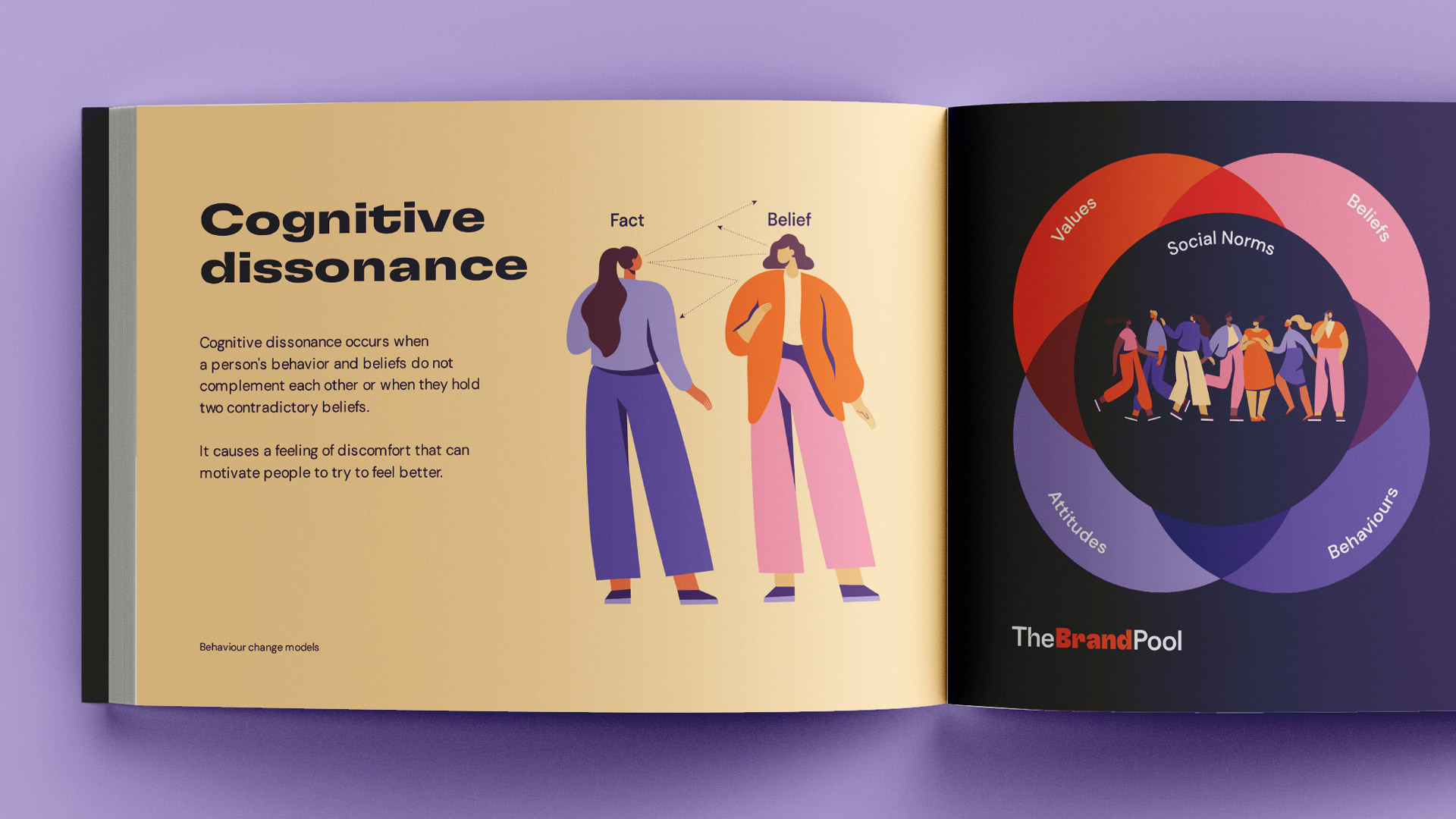
We explore how to use behaviour change models to create impactful public education campaigns that lead to positive and lasting change.
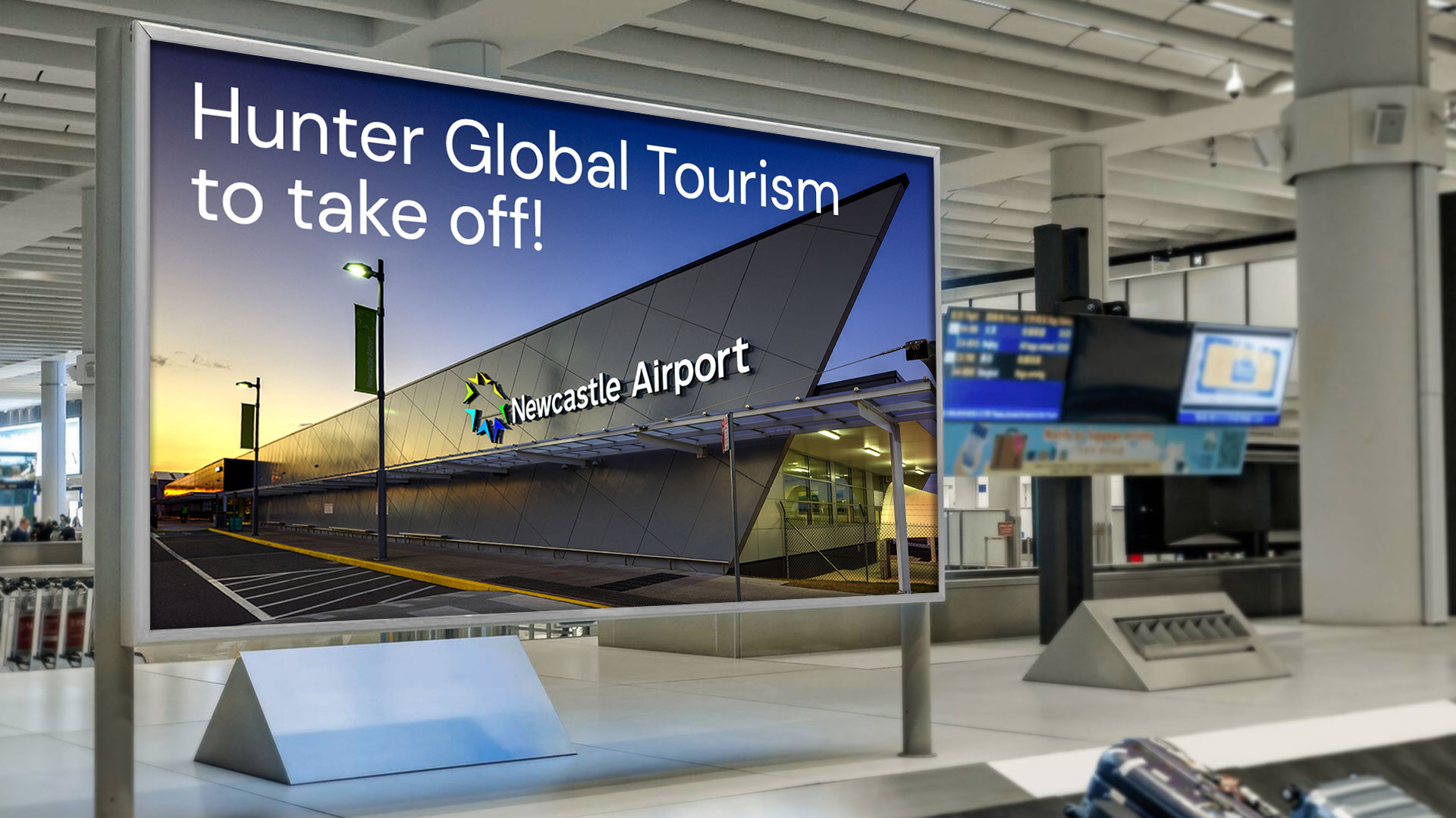
We unpack the Hunter Joint Organisation’s Global Tourism Marketing Strategy and examine the methods destination marketers can employ to attract international visitors.
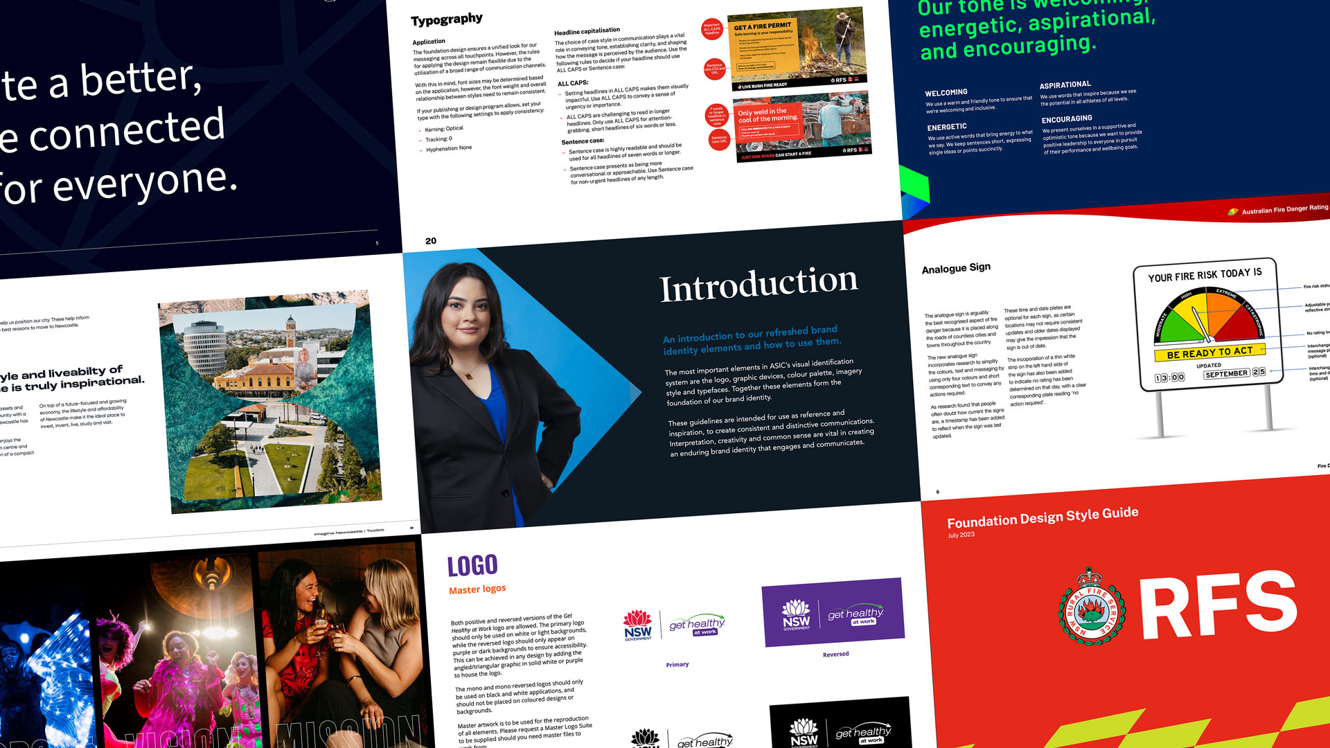
We unpack the differences between brand books and brand guidelines and how they can strengthen your brand’s identity and impact.

We explore what the rise of ecotourism means for destination marketing, and how regions can effectively showcase their sustainable offerings.
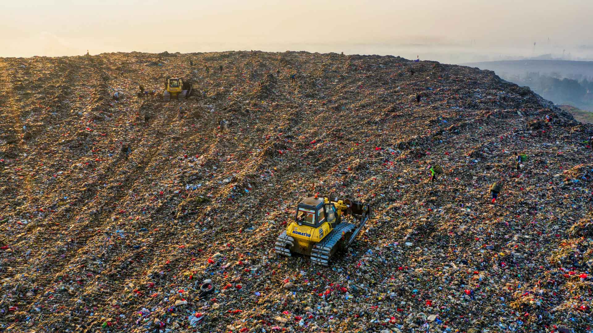
We explore the powerful role that changing our habits and learning more about sustainability can play in waste management.