With more and more brands competing for share of voice, it has become crucial for brands to make an impactful and memorable impression on potential customers and form a true connection.
When building brands we consider many things. Your tone of voice, the balance and harmony of your logo (or a new logo entirely!), brand colours, the use typography and of course – brand imagery. It’s the combination of all of these elements that help us to tell an authentic story about your business, enabling you to connect with your customers in a more meaningful way.
Too often companies opt for generic corporate photography (or worse, obvious stock imagery which is available for use by their competitors!) and, while these images have a valuable place in some industries, they can make your brand look disingenuous, indifferent or just plain boring if used too frequently and without much consideration.
Illustration has the ability to solve problems and communicate powerful messages to your audience – don’t underestimate the power of using illustration for your brand.
The benefits of bespoke illustration
Developing a unique and ownable illustrative style for your brand can grab (and hold) your audience’s attention and help your brand stand out from the competition.
Illustrations can be used to humanise your brand, and provide depth to your brand’s identity. They can add flexibility to your brand system, providing a diverse toolkit for a variety of applications on and offline – the result? A dynamic, engaging and impactful brand – that is anything but boring.
Importantly, illustration can help add clarity and communicate complex ideas. It can help to visualise more abstract concepts in a way that standard photography just cannot. And, it can capture the values and personality of your brand in a single voice and speak more directly to your customer.
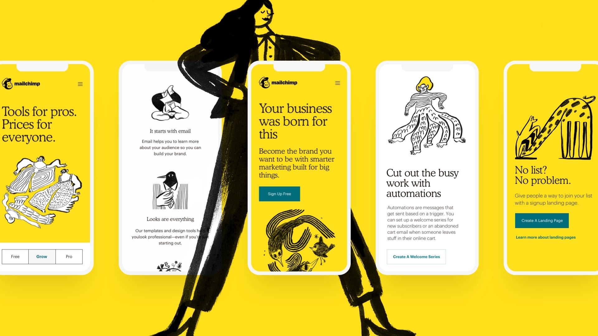
Case study: Mailchimp
When Mailchimp launched a new campaign called “More Than Mail” they used illustrations instead of their usual graphs and charts, to help bypass the jargon and distill its message: helping small businesses connect to their customers.
More than 100 illustrations were commissioned from artists like Franz Lang and Amber Vittoria to help create videos providing the visual identity for the campaign.
The energetic, sketchy style encapsulates an impression of speed, and a personal touch which goes hand-in-hand with the brand’s mission to make email marketing as quick and easy as possible for its subscribers.
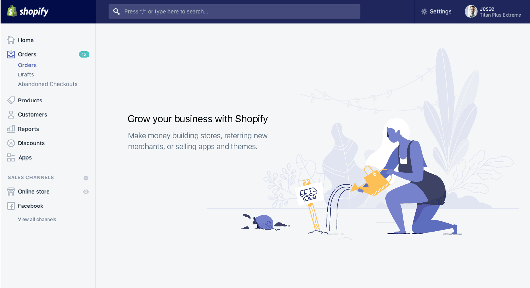
Case study: Shopify
Illustrations were not new to Shopify’s brand identity. However, their original style did little to enhance communications. Not only was it inconsistent in style, it simply reflected what the copy had already articulated. It was limiting, generic and did not add value to the brand story or visual identity.
Their new illustration style was developed to evolve as their brand grows. The illustrations serve to help the user feel confident and inspired to do more. Using illustration they are able to visualise abstract concepts and metaphors. The result is not only consistent, but it feels unique and enhances and amplifies the brand’s identity and voice.

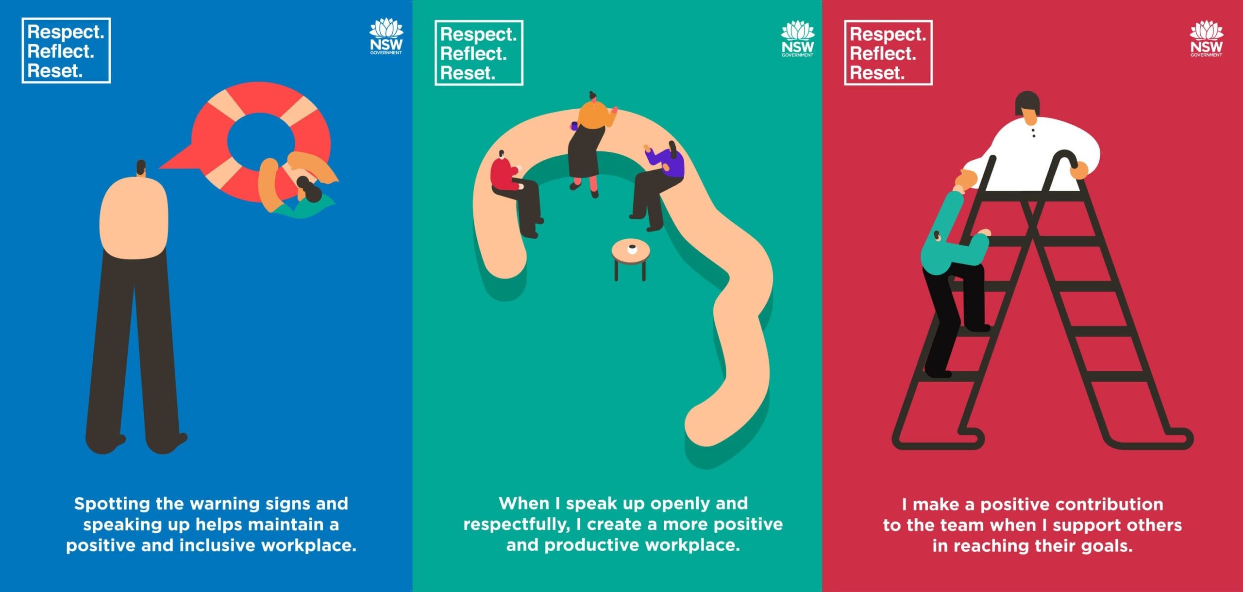
Case Study: NSW Public Service Commission
Bullying in the public sector was widespread, with over 50% of workers experiencing or witnessing it first hand. We were asked to develop a campaign to help achieve a positive, productive and respectful workplace in the NSW public sector.
The challenge was to find a way to engage our audience and effectively communicate diverse and complex concepts to an even more diverse audience (from teachers and nurses to police and office workers…) in order to make an impact and change behaviour across the entire sector.
We explored and tested a variety of creative concepts (including photography) but ultimately, we found that in a workplace environment, photos of people in an office simply did not have the desired impact or cut through.
We commissioned world-renowned illustrator Magoz to produce a series of playful, and thought-provoking illustrations which allowed us to intelligently communicate nine complex themes of bullying in the workplace (without modelling bad-behaviours or singling out a group or individual).
By engaging our audience with illustration and animation, we were able to authentically connect with employees and communicate a complex problem in a simple yet visually impactful way.
Interested in discovering how illustration could be used to build your brand? Get in touch.
We work with businesses big and small to create brands that not only look great but tell engaging stories that are relevant to customers. If you need help with your brand – give us a call, we’d love to help.
The Brand Pool is a creative agency with a vision to be the best storytellers we can be.