Your brand font says more about your business than you think.
Building a successful brand is not an easy task. From the logo design to choosing your colour palette and developing brand messaging – it all has to come together seamlessly to tell the story of your brand.
This story needs to resonate with your audience and feel authentic to your business.
When talking to a designer, they’ll likely tell you the same thing: The typeface you choose can affect the way your brand is perceived.
The perfect font is unique, memorable, legible, accessible and of course, authentically conveys your brand personality.
Whether you know your serifs from your sans-serifs or couldn’t pick Helvetica from Arial in a lineup – one thing is for sure, fonts have real power in brand and communication. They can speak volumes about your brand or product – good and bad!
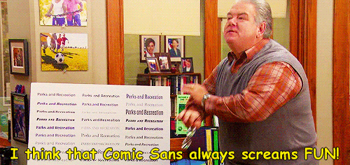
Want to be taken seriously? Stay away from Comic Sans, more on that later.
The influence of fonts on human behaviour
Back in 2012, documentary maker and New York Times contributor Errol Morris worked with Michael Bierut of Pentagram to test the theory – can a font make us believe something?
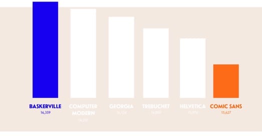
Readers were asked to verify whether or not a series of statements were true. Each test was presented in a different typeface to see whether the believability was affected by font selection: Baskerville, Computer Modern, Georgia, Helvetica, Comic Sans, or Trebuchet—three serif, three sans-serif fonts.
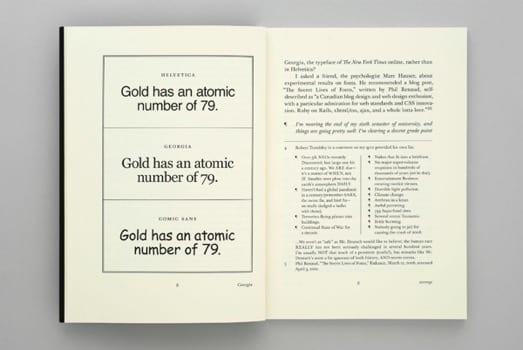
The results showed that traditional serifs, like Baskerville, made statements seem more trustworthy, while a more child-like font, like Comic Sans which resembles chalkboard style writing, was seen as less believable.
In fact, of the fonts tested, Baskerville was deemed most believable of the fonts tested.
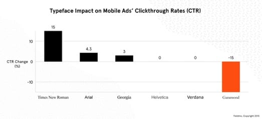
Yieldmo, a digital advertising company in New York, wanted to test this theory further, begging the question – which fonts are most clickable?
Like the New York Times, they tested three serif and three sans-serif typefaces on more than 2 million people across the mobile web.
The clear winner was Times New Roman (+15%), and as a result of this test, Yieldmo considered shifting their mobile ads’ default font from Helvetica to Times New Roman.
What these experiments show is that typefaces can have an emotional and psychological impact on us. As designers, this is something we leverage for the benefit of your business. Whether that be enhancing your brand story, shifting your brand position, changing your brand perception or even influencing your customer’s behaviour when interacting with your product or service.
Accessibility and Inclusivity
In recent years, strides have also been made to design typefaces which are more inclusive.
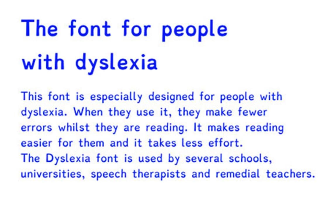
Dyslexie, a font developed with unique letterforms to combat difficulties, has special attention to leading and kerning to increase legibility. As seen below, carelessly designed typefaces can dramatically impact usability and legibility.
Designing for good
Another experiment, conducted by Monotype and MIT Media Lab, concluded that by switching the font used in vehicle dashboards, they could improve reaction times by double digits.
By moving from geometric sci-fi inspired typefaces, like Eurostile, to more humanistic and varied grotesques, like Myriad Pro, highway drivers could stop 18 meters sooner on in an emergency.
These experiments prove that typography is a powerful lever for influence.
Custom typefaces
Much like developing a unique logo or commissioning bespoke photography and illustration for your business, companies are investing in custom typefaces as another way to make their experiences stand out: to feel more iconic, special, and meaningful.
From Airbnb to Google and IBM, they have all created custom typefaces to help them overtake impersonal marketplaces with more personable customer experiences.
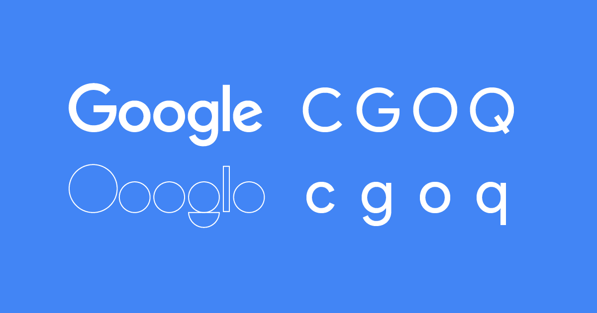
Google’s custom typeface called Product Sans is a great example of a typeface that communicates friendliness without being juvenile (like Comic Sans); it inspires trust and reliability without appearing intimidating or overly formal. It also serves to connect all of their products under a united type system – a custom typeface which can strengthen brand perceptions within the user experience.
Impact and influence
Typefaces can have both an emotional and psychological effect on us – and they can impact and influence user behaviour.
Traditional serif fonts are trustworthy, more formal and can help long paragraphs of copy more readable. In contrast, sans-serif fonts are more informal, friendlier, clear and generally more accessible.
And, as those experiments showed, typography certainly has an impact on our judgement; we’re just not always conscious of its effects.
So, what about Baskerville and Times New Roman was subconsciously trustworthy?
Bierut likens the reaction to typefaces to the way a voice can impact the way we perceive what’s been spoken.
“In a way, typefaces are the graphic equivalent of the human voice, and each voice has a specific timbre and accent,” he says. “In my mind, Baskerville speaks with a calm, confidence-inspiring English accent, sort of like Colin Firth. No wonder it’s so trustworthy.”
What does your font say about your brand?
We work with businesses big and small to create brands that not only look great but tell engaging stories that are relevant to customers. If you need help with your brand – give us a call, we’d love to help.
The Brand Pool is a creative agency with a vision to be the best storytellers we can be.